
 BTC
BTC
 ETH
ETH
 LTC
LTC
 BCH
BCH
 DOGE
DOGE
 USDT
USDT
 DASH
DASH
 XRP
XRP
 USDC
USDC
 XMR
XMR
 BNB
BNB
 TRX
TRX
 SHIB
SHIB
 DAI
DAI
 ZEC
ZEC
 SOL
SOL
 ETC
ETC
 POL
POL
 XLM
XLM
 ADA
ADA
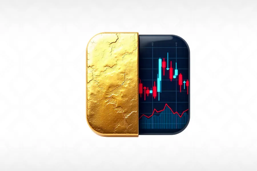
This is why investing with a stock market map is now vital for all modern investors.
A stock market heatmap is a graphical representation of the current State of the Market, helping investors visually see which sectors are performing well, which are struggling, and how large-cap stocks are reacting to changes in the broader economy. When used correctly, these visual investment tools can also help investors visualize the relationship between large-cap stocks and gold and silver, which are the most commonly used assets for hedging in a diversified portfolio.
Why Visual Market Tools Matter More Than Ever
Market volatility has increased significantly over the last decade. Events such as rapid inflation, geopolitical conflicts, and global supply chain disruptions have created conditions whereby equities can rise or fall sharply in a matter of hours. Traditional line charts or written economic reports cannot communicate market sentiment fast enough.
Heatmaps provide a simple and immediate snapshot of market performance. With a quick glance, the investor can understand:
- Which sectors are leading (tech, energy, consumer discretionary)
- Which areas are underperforming?
- Capital concentration within blue-chip versus mid-cap stocks
- How fast sentiment shifts during high-impact news
This matters because equities and precious metals often move in opposite directions. Historically, in a struggling stock market environment, gold and silver rise as safe-haven assets. Understanding this dynamic in real time helps investors rebalance their portfolios more efficiently.
How a Stock Market Map Helps You Balance Metals and Equities
To make informed allocation decisions, investors must consider the entire ecosystem, not just individual assets. A heatmap provides that ecosystem-level view.
1. Quickly Identifying Market Strengths and Weaknesses
A color-coded heat map makes market behavior intuitive. Red blocks show declining stocks, while green blocks show growth. When large sectors turn red simultaneously, that can signal an upcoming flight-to-safety movement where precious metals may soon see increased demand.
2. Market Sectors vs. Metals Performance
Investors who follow contemporary bullion trends often relate sector performances to data on metals from reputable market reports. Knowledge gained from continued coverage regarding the release of modern coins can provide historical context on how the prices of metals move in relation to market cycles. Combining these insights with real-time heatmap data enables investors to predict market fluctuations with greater accuracy.
3. Identification of Relations and Inverse Relations
- Stock market maps make large patterns easy to see. For example:
- Whenever tech stocks rise, the price of gold typically falls.
- Metals tend to strengthen when inflation fears rise, while equities tend to weaken.
When consumer confidence falls, silver usually outperforms the industrial sectors. These patterns are clearer when they're visualized instead of buried in spreadsheets or monthly charts.
Precious Metals are Becoming Increasingly Valuable in People's stock-heavy investments.
Precious metals help investors mitigate risks during volatile markets and the occurrence of catastrophic events:
- Stock market fluctuations caused by territorial conflicts or as countries devalue their currencies
- Inflation occurs when the US dollar loses value due to the printing of massive amounts of US dollars, leading to higher prices for precious metals.
- Geopolitical tensions and/or the financial instability of countries
Investors who only invest in stocks do not have an avenue for protection when market conditions change abruptly; therefore, the downside risk of the investment is greater than that of precious metals. Precious metals investors stay informed about what drives the prices of precious metals globally and know how to analyze this information to make more informed investment decisions. Investors who study data pertaining to the global market for precious metals can better identify cycles where precious metals may outperform their equity counterparts, particularly by using a stock market map.
How to Use a Heatmap to Determine if Precious Metals Need to Be Balanced Out with Equities
When you rebalance regularly, it helps you achieve better results by providing feedback on how well you are doing in terms of balance between your equity/metal exposure, as well as how many equities you need to sell to restore the proper balance. By providing you with immediate feedback on your rebalanced portfolio, heat maps enable you to adjust your portfolio in response to real-time market changes.
Instead of blindly buying/selling precious metals, heatmaps can help you identify which industries are in decline. The reason for this is that, typically, only a handful of sectors or industries have a significant impact on stock prices. Therefore, the heatmap enables you to identify and avoid a potential overreaction to events occurring in a specific sector/industry, or in the overall marketplace.
Long-term investors can utilize heatmaps to make informed decisions about their investments and minimize the emotional decision-making that can occur during periods of high volatility or uncertainty. In contrast, short-term traders can benefit from using heatmaps to identify potential patterns that indicate quick rotations and can use metals as a hedge if the markets begin to exhibit rapid fluctuations.
How to Interpret a Stock Market Map Effectively.
Knowing how to use a stock market map doesn't just involve looking at colors; it's about understanding what the colors represent in context.
Green Doesn't Always Mean Buy
A sector could be considered green simply because it is rebounding from a major decline.
Red doesn't always mean panic. The reason may be that it's red because of profit-taking after a strong rally.
Size Matters
Larger blocks reflect companies with larger market capitalization. Large-cap stocks, when shifted decisively in one direction, tend to have a stronger impact on metals demand.
Sector-Level Patterns Matter Most
If several defensive sectors, such as healthcare and utilities, turn green while growth sectors turn red, it may indicate a shift into safer assets, including precious metals.
Integrating Heatmaps into Your Investment Strategy
Here are some practical ways investors can use a stock market heatmap daily:
1. Morning Market Scan
Start your day with a heatmap to assess sentiment.
Are markets trending bullish or bearish? Are metals rising? Which sectors are reacting first?
2. Tracking Reactions to Economic Announcements
Heatmaps respond right away to announcements like:
- CPI inflation numbers
- Interest rate updates
- Jobs reports
- Global political events
Once inflation data turns the map red, this usually means that gold and silver head higher. Heatmaps allow you to visualize the reaction in real-time.
3. Utilizing Metals as a Counterbalance
When equities are overheated, metals serve as an important stabilizer. If the heatmap shows unsustainable green across speculative sectors, that might be a signal for the upcoming correction.
Using the Right Tools for Better Market Insight
Heatmaps from various trading platforms help many investors evaluate the market behavior in a more detailed way. You can instantly visualize the real-time market strength and sector movements, simply by clicking on any Stock Market Map - possibly on one of the leading charting platforms.
Summary
Heatmaps have revolutionized the way individual and institutional investors can visualize asset allocation among equities and Precious Metals using a Strategic Method of Asset Allocation. With the ability to view the Heatmap while learning how to utilize a Stock Market Heatmap, they can better understand how all assets within the Market correlate with each other, make more informed decisions based on market action, anticipate changes in the market, and intelligently diversify their risk across multiple asset types. As markets become increasingly volatile, investors will continue to rely on visual representations of data for faster, more confident decision-making.